

Glucose Monitoring for Children with Diabetes and Their Caregivers

ROLE
UX Research, UX Design, UI Design, Brand Design
TOOLS
Adobe Illustrator, XD, Photoshop
SKILLS
User Interviews, Competitive Analysis, User Personas, User Journey Mapping, Wireframing, Prototyping, Usability Testing, Multi-viewport UI Design
TEAM
Solo Coursework
UX/UI & Brand Design
National ADDY Award Winner
CHALLENGE
The Wheel of Doom Sparks Creativity
For the parameters of the assignment, my professor spun the Wheel of Doom™ to assign the product, audience, etc. We arrived at:
Health data display and dashboard for wearable fitness tech
Audience = children 2–12
Include login, account page, and third screen
Include desktop, mobile, and third viewport size
Interpreting this, it occurred to me that children don’t traditionally have a lot of concern about fitness, and that a health monitor may better serve my user. Thinking about the wearable aspect, I opted to create a product to help children living with Type1 Diabetes and their caregivers monitor data in conjunction with a wearable glucose monitor.
A Spoon Full Of Sugar
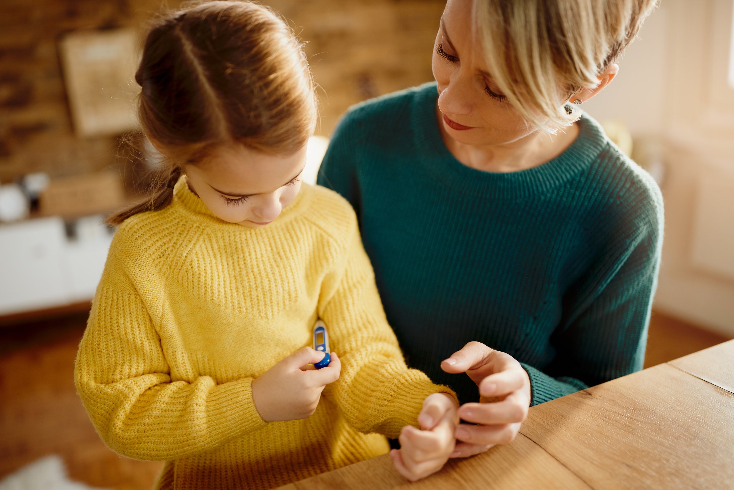
Children living with Type 1 Diabetes have a particularly hard time monitoring their glucose levels. As kiddos, they are just learning how to stay in healthy ranges. Caregivers (parents, teachers, school nurses, etc.) can also have a hard time staying informed about glucose levels that change every few minutes. Many opt to wear a Continuous Glucose Monitoring (CGM) device, inserted under the skin.
Users need a simple CGM interface targeted to their age group to empower them to manage their glucose levels. Caregivers need an option to access in order to stay informed, and alerted when necessary, about children's care.
THE DESIGN

Based on user interviews & testing:
3 Viewports
simplified smartwatch for kiddos focuses on the key info: are they in a safe glucose range?
web and mobile apps with rich data and features for parents and caregivers
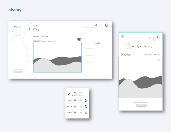
4 Main Screens
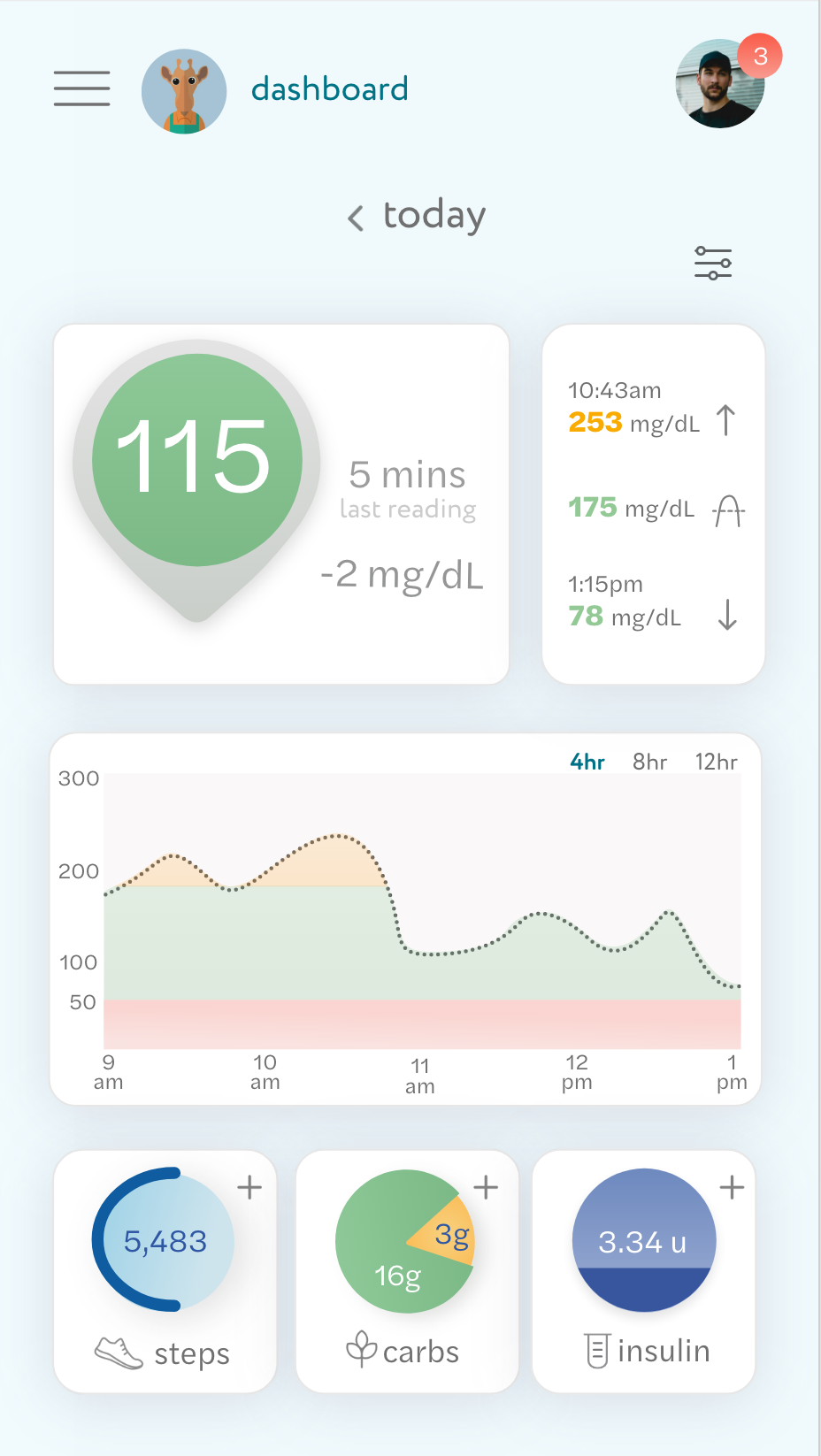
Dashboard
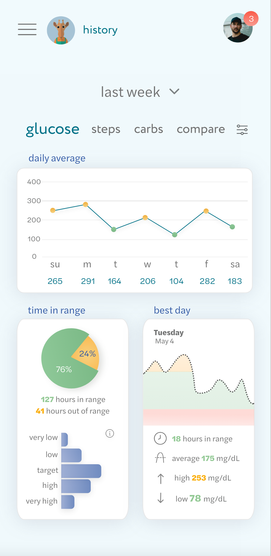
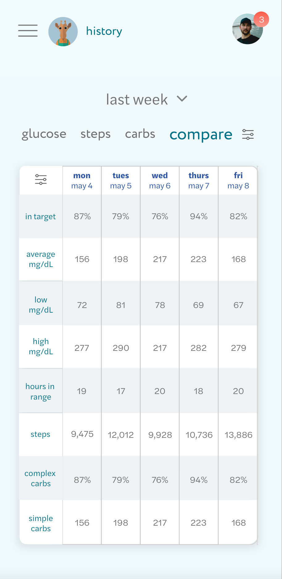
History
Messaging
Learning

Features
• Simple, at-a-glance data visualizations
• Customizable according to health priorities
• In-app messaging and alerts so parents remain in sync with teachers, etc.
• Gamified learning unlocks new features = app grows as they grow
• Overview of progress to learn about patterns = history visualization
• Log meals, physical activity
• Night Mode
• Nutrition label scanning

Final Screens


Mobile Login
Mobile Dashboard
Mobile History
Mobile History w/ Sticky Tabs

So, how did we get there?
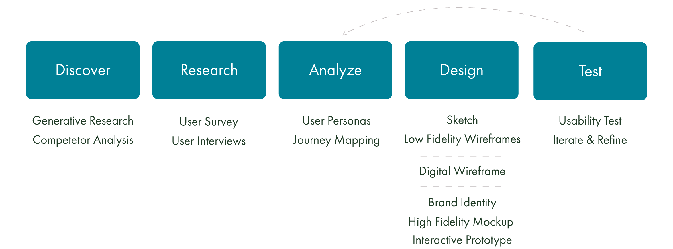
PROCESS
RESEARCH
Goals
Understand the Continuous Glucose Monitoring (CGM) product landscape
Discover how people currently use wearable CGM devices to monitor glucose levels
Identify what data users most desire in monitoring their glucose
Identify pain points users have with the current experience of CGM wearables
Discover what features help users eliminate the mental strain of monitoring glucose
Generative Research
To understand how to simplify the multitude of information people with diabetes monitor, I needed to gain a basic understanding of the condition. A few things that stuck out as pertinent to users of this product:
A self-managed condition: that comes with mental strain
People with diabetes are chasing equilibrium
Need to check blood sugar before meals and at bedtime
Can use a CGM as an alternative to finger-prick testing
I also wanted to understand how gamified learning can help kiddos develop meaningful routines and habits. Some things I took into my concepting included:
Displaying data in a way kids can understand
Differing user age levels
Differing experience of self-managing
Tailoring to both internally and externally motivated users
Competitive Analysis
A Continuous Glucose Monitor (CGM) is a sensor inserted under the skin to measure glucose levels every few minutes.
There are a number of CGM products on the market, with varying features and depth of interactivity.
I used BlueLoop as a basis to inform my survey questions to explore what frustrations people living with diabetes have, what features they find useful, and their current routines.
Blueloop is the only product in its category whose target audience is children. It allows users, caregivers, and parents to interact via website and mobile messaging. Users can log information like meals and real-time readings. In-app messaging allows users to keep in contact. It is a robust product, with uninspiring UI.
UNDERSTANDING THE USER
Survey and Interviews
What are the most frustrating things about managing diabetes?
The constant need to monitor and read every label
Not being able to indulge in foods
What frustrations might apply to children and their parents managing diabetes in particular?
Difficult to keep a routine
Monitoring while away from parents
Otherness
Harder to understand limitations
What are the top problems you would address? What features would you most want to include?
Mobile label scanning
Easier monitoring system
Nutrition education, getting the new monitoring tech into the hands of all diabetics (access)
Staying on top of insulin doses and blood sugar testing
Fun graphics and characters
Remind when sugar needs to be checked
Presenting medical information in a kid-friendly way
Help parents and kids stay on the same page about diets, when/ how much insulin they are taking.

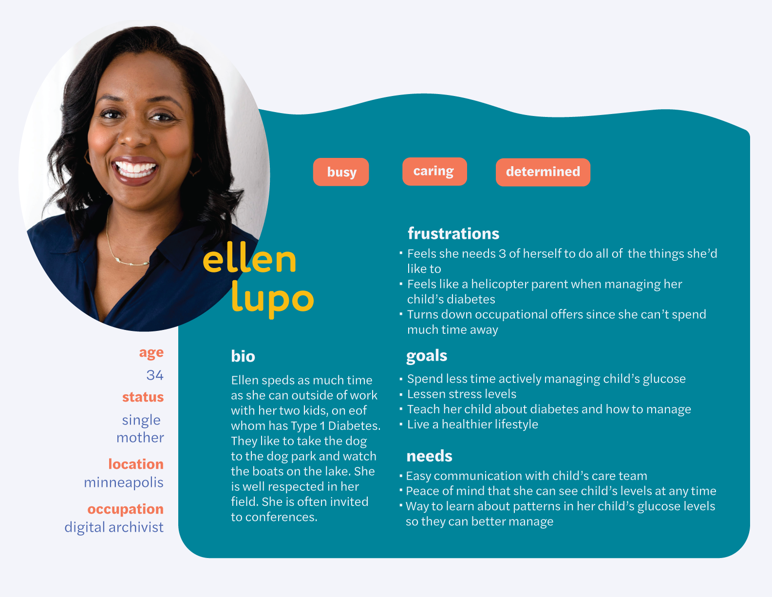
User Personas
WIREFRAMING FOR USER FEEDBACK
I user-tested some low-fidelity wireframe layouts to determine what information would benefit from being grouped, and how to include the necessary data without visually overwhelming the screen. User feedback included:
• Confusion about some of the data grouping
• Keeping the glucose monitor pinned to the menu for best access
• An empty learning dashboard may feel lonely and limit motivation

BRANDING

Mezzo = "mid" or "middle" in Italian
Derived from the goal range for glucose levels
Kid-friendly and engaging, yet trustworthy (without feeling too medical, so kids want to use it and caregivers can trust it.
Logo
Wordmark in kid-friendly lowercase
Curved line representing the glucose graph
Friendly sugar glider to guide through learning
Color Scheme
Red, yellow, and green of the glucose graph
Softened the red to a coral to minimize the feeling of alert
Focus on green = represents a healthy range level
Indigo and teal to feel lively and balanced
TAKEWAYS
Reflections
This product exposed me to complex data visualizations. I learned many of the flashy visualizations that appeal to us like those with 3D elements are not particularly functional, and that the trusty ol' bar chart is generally the easiest to interpret. I also enjoyed learning about gamification to motivate learning, and to address both self-directed and externally-directed learning styles.
Challenges
The key obstacle with this product was in trying to simplify complex data. To be a truly useful product users needed important health data at a moment's notice.
There were also challenges in designing a comprehensive product for users that varied in age, experience with managing diabetes, experience in using digital products, and learning styles. Making the information displayed as customizable as possible became key. Using the Mezzo brand character to guide young users through learning modules designed to unlock features as they grew was also a beneficial solution.
Moving Forward
The ideal next step would be running the prototype by a diabetes healthcare professional to ensure it is medically usable. Being a conceptual product, Mezzo would also need further usability testing on both caregivers and young diabetic users to refine the UX and UI alike.